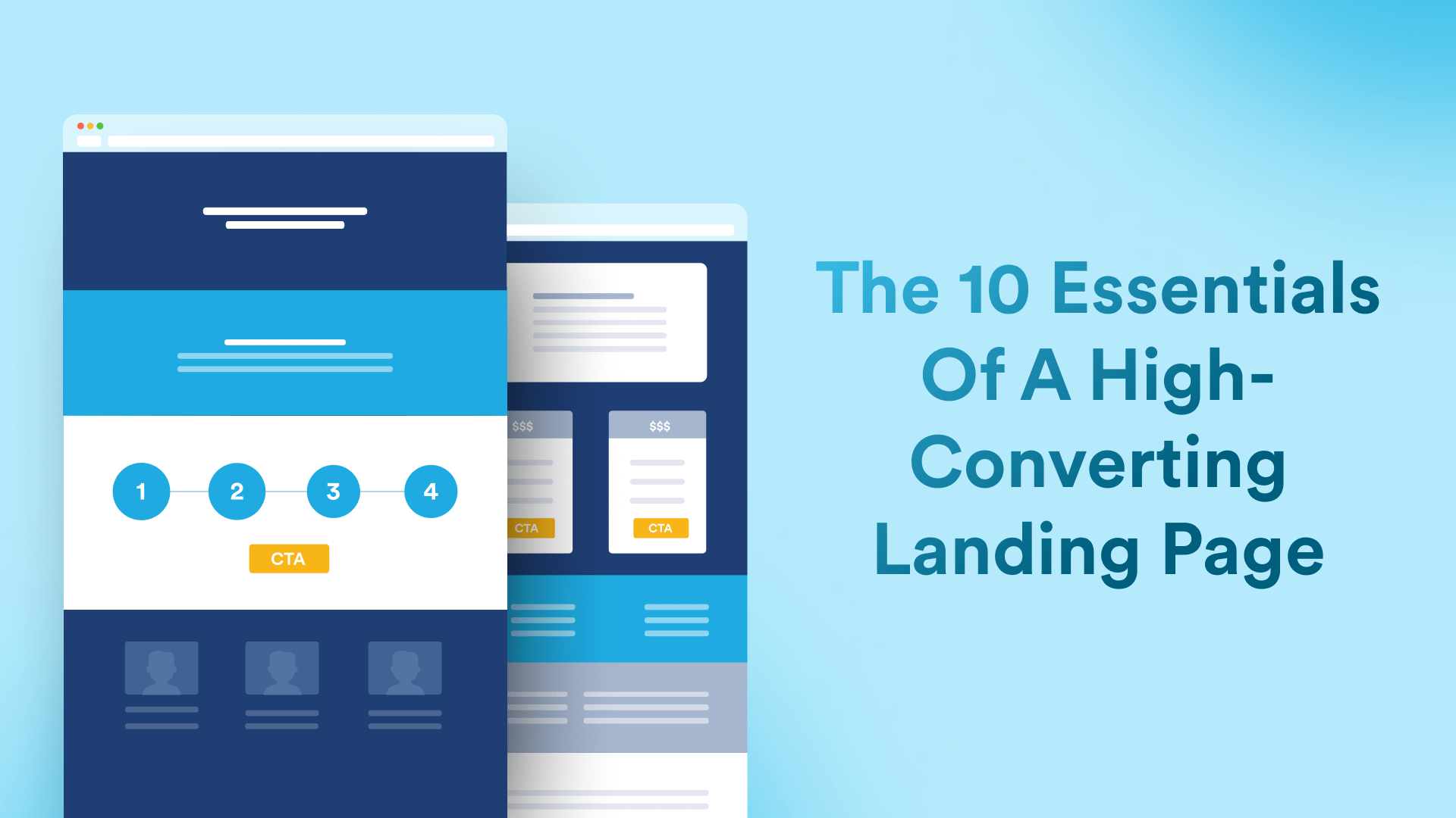
The 10 Essential Sections of a High-Converting Landing Page

Membership.io Team
Your landing page has one job: get someone to take a specific action.
It’s not just another spot on your website. It’s your 24/7 salesperson, your online hype crew and your “hey, stop scrolling and pay attention to this” thingamajig.
If you're running and growing a membership, you’re likely going to need one.
If it’s confusing or cluttered, your audience will leave.
If it’s clear and convincing, they’ll click (and hopefully get out their credit card and join).
Whether you’re selling a membership, a digital course, or just trying to grow your email list, here are the 10 essential sections your landing page needs to boost conversions (without sounding like a late-night infomercial).
1. A Header That Says Exactly What You Offer
Your headline is the first thing visitors will see and read. Think of it like your online elevator pitch, without the awkward small talk.
The goal here? Instant clarity. Tell people what your product is and who it helps. Bonus points if you can describe the transformation.
Quick Tip: Remember, people don’t buy stuff. They buy answers to their questions and solutions to their problems.
Use everyday language that people can understand. Skip clever slogans and trendy words. A little less rizz (had to Google that one) and a lot more straight to the point.
People shouldn’t have to think too hard to “get it.”
Consider adding some bullet points beneath it to highlight pain points and show a peek at the outcome they’re going to get.
Example:
Launch your membership in 30 days or less
- No tech skills needed
- Simple daily steps
- Real support from real people
Ask yourself: would a stranger understand this in 10 seconds or less?
If you can nod your head “yes” then you’re off to a good start.
2. Quick Intro to the Product or Offer
Once you’ve got their attention, give your audience a quick snapshot of what’s actually on the table. Explain what it is. This isn’t the time for a 2,000-word manifesto. Use one or two short sentences. Keep it light, breezy, and benefit-focused.
Remember: they’re not buying a course or a membership, they’re buying a result.
Example:
“The Creator’s Launch Lab is your step-by-step guide to building a profitable membership without tech headaches or burnout.”

3. The Transformation
Here’s where you tell the story of change.
What does life look like before using your offer?
What does it look like after?
Your goal: paint a picture of the journey they’ll go on with you. Describe the path from start to finish.
Keep it grounded and realistic. Have empathy and understanding for where they’re at now. Show that change is possible.
And your solution (whether that’s a course, membership or coaching program) is their step-by-step path to get there.
“This time it’s different.” That’s the vibe you’re going for here.
Example:
Before: You're stuck with too many ideas and no plan.
After: You launch a clear offer and start making sales.
In between? Describe the steps it takes people to get there.
Quick Tip: A visual showing the transformation is powerful here.
4. Introduce the Guide
We know you're amazing, but your audience is the hero of this story.
Use this section to introduce yourself in a humble, relatable way. You’re here to guide them. Support them. And be their biggest cheerleader.
Tell them who you are and why they should trust you.
Share your experience and credentials. What makes you the expert here? Be honest and bring your heart, too! People like doing business with people they can trust.
Example:
“Hey, I’m Jess. I used to dread logging into my course platform. I’m not a techie, and the idea of creating anything online made my head spin. Fast forward to today… I now help hundreds of creators just like you launch online courses they actually love running.
Quick Tip: Not the expert? Don’t sweat it. Whether it’s you, a business partner or client you’re building a landing page for, this is space to showcase the “face” of the offer.
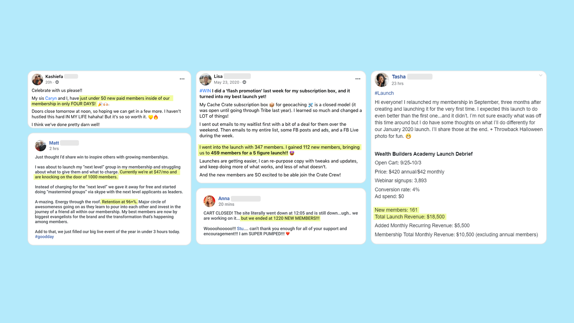 5. Social Proof (Because Nobody Likes to Be First)
This is where your testimonials come in. Think screenshots of posts or comments on social media, written stories, emails… stuff that adds to your credibility without you saying it.
They’re more than just nice-to-haves. They're conversion rocket fuel.
Make sure they’re outcome-focused, relatable, and short (if possible). If they’re long, highlight or pull out a headline with the most important information.
Avoid vague praise like “this was great” or “Joe is awesome!”
Don’t make them up, either. That’s a no-no. Make sure they’re from real people, getting real results in your real program.
Great testimonials speak to:
- Results (“I made back my investment in 2 weeks!”)
- Emotional wins (“I finally felt confident putting myself out there.”)
- Skepticism or objections crushed (“I didn’t think it would work for me—but it totally did. Here’s what happened…”)
If you’re just getting started and don’t have testimonials yet? You have two options. Share your own story. Or, share results from your first customers. Can’t get any customers? Let them join for free. Then tell their stories!
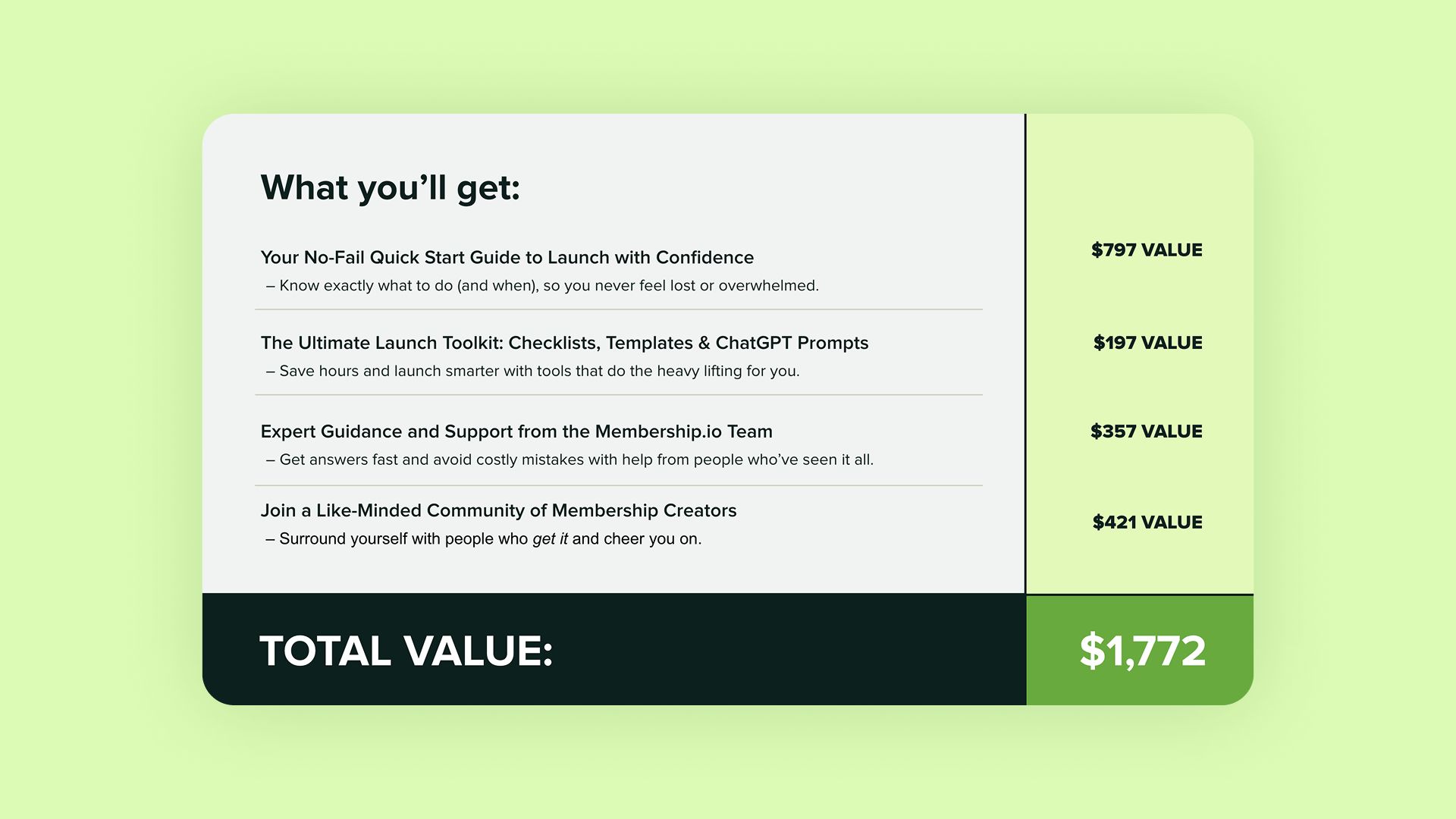
6. The Offer (What They Get)
Here’s where you detail what they’re going to get. Think modules, lessons, live calls, resources, downloads, community access, templates and more.
Quick Tip: Struggling for ideas? Head on over to ChatGPT and use this prompt: Can you provide some examples of resources and deliverables to include in a [DIGITAL PRODUCT] about [TOPIC]. Give 10 examples. Clearly and succinctly explain the specific outcome and/or benefit of each item in simple language.
Clearly explain each item. Bullet points can help.
But here’s the trick. Don’t just list the features and stuff. Pair everything they get with a specific outcome or benefit.
Example:
- 4-week video course – Learn each step one step at a time.
- Weekly live calls – So you never have to figure it out alone.
- Content vault – Everything you need, all in one place.
- Templates – Save hours on setup.
And yes, stack the value and show it. People love to see the real-world value of what they’re buying.
7. The Bonuses
Add extra items that make your offer just a little bit sweeter. Good bonuses can make your offer irresistible.
These should relate directly to your main offer and product.
Make them relevant (no fluff). Have a clear value. And create urgency around them, such as limited time, this week only, or fast action.
Make sure you have a value for each bonus.
Quick Tip: A really good bonus breaks objections that your audience has to buying your product.
Examples:
- Bonus: The “Launch Email Swipe Pack” ($97 Value)
- Bonus: 30-Min Tech Setup Call ($147 Value)
The goal is to have your audience thinking and saying, “Wait... all that is included?! I need to join NOW!”
8. Price and Payment Options
It’s time to talk money.
Be direct. Be transparent. And be clear about how much they’re paying and what they’re getting in return.
Use a value stack to summarize everything included and how much it’s worth. Then, present your price as the no-brainer option it is.
Try to avoid fine print or hidden costs.
Example:
Core Program: $999 Value
Bonus 1: $299 Value
Bonus 2: $199 Value
Bonus 3: $399 Value
Bonus 4: $99 Value
Total Value: $1,995
Your Investment: Just $99 today!
Quick Tip: If you have a higher ticket product, consider offering multiple payment options. For a membership, there may be a discount for annual compared to monthly.
9. Your Guarantee
Even the most excited people will hesitate and pump the brakes if they feel like they’re taking a risk.
That’s where your guarantee comes in.
Whether it’s a “14-Day Money Back Guarantee” or a “Love It or Leave It” promise, make it clear, obvious, and easy to understand.
The goal is to give your audience a little bit of peace of mind.
Guarantees don’t just protect the customer. They show you’re confident in your product!
Example:
- Try it for 14 days. If it’s not a fit, email us for a full refund.
10. Call to Action (CTA)
You’ve guided them through the journey, broken down possible objections, and stacked the value. Now it’s time to make a decision and click that button.
Your call to action (CTA) should be clear. No clever puns here. Just tell them exactly what to do next.
Use strong, simple text. You want it to stand out.
Examples:
- Join Now!
- Start Today
- Get Instant Access
- Let’s do this
- Start your journey
Consider adding a little oomph to your CTA with urgency or scarcity. Don’t fake it. It has to be legit.
This could be a limited number of spots or the first live call happening on Monday. Countdown timers can help!
11. Additional Considerations
Make it mobile-first
More than half of all purchases happen on mobile. And sources show this will increase to almost three-quarters by 2028. (Oberlo, Capitaloneshipping.com)
That means, if your page doesn’t work (or look great) on a phone, you’re leaving money on the table.
Test it on multiple devices.
Make it easy to read
Avoid fancy script fonts. Keep your font size large for easy reading (mobile-first, remember). Cut anything that distracts.
Focus on transformation (not stuff)
This one is HUGE.
People don’t care about “12 modules” or “PDF downloads.” They care about results. How is your offer going to solve their problems or make their life easier or better?
Wrapping Up
A great sales page isn’t pushy, it’s persuasive. It meets your audience exactly where they’re at, and guides them toward a decision that feels empowering.
Whether you’re launching your first lead magnet, opening the doors to your membership, or fine-tuning one of your existing pages, these 10 sections will help your landing page convert more eyeballs into customers.
Let’s go turn those clicks into members.
Related posts
See more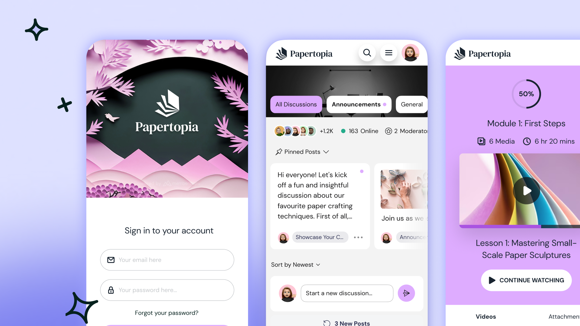
Why Your Membership Site Needs a Mobile App (and What It Won't Fix)
Membership.io Team
June 18, 2026

How to Use Webinar Funnels to Drive Membership Conversions
Membership.io Team
July 23, 2026
How to Use Pinterest for Business and Turn Pins Into Recurring Members
Membership.io Team
July 2, 2026
Stay in the loop
Don't miss out on our latest news, tip and content! Join our mailing list and get exclusive tips, tricks and the latest insider hacks.